CargoKite
Brand Development and Storytelling for a New Class in Cargo Shipping
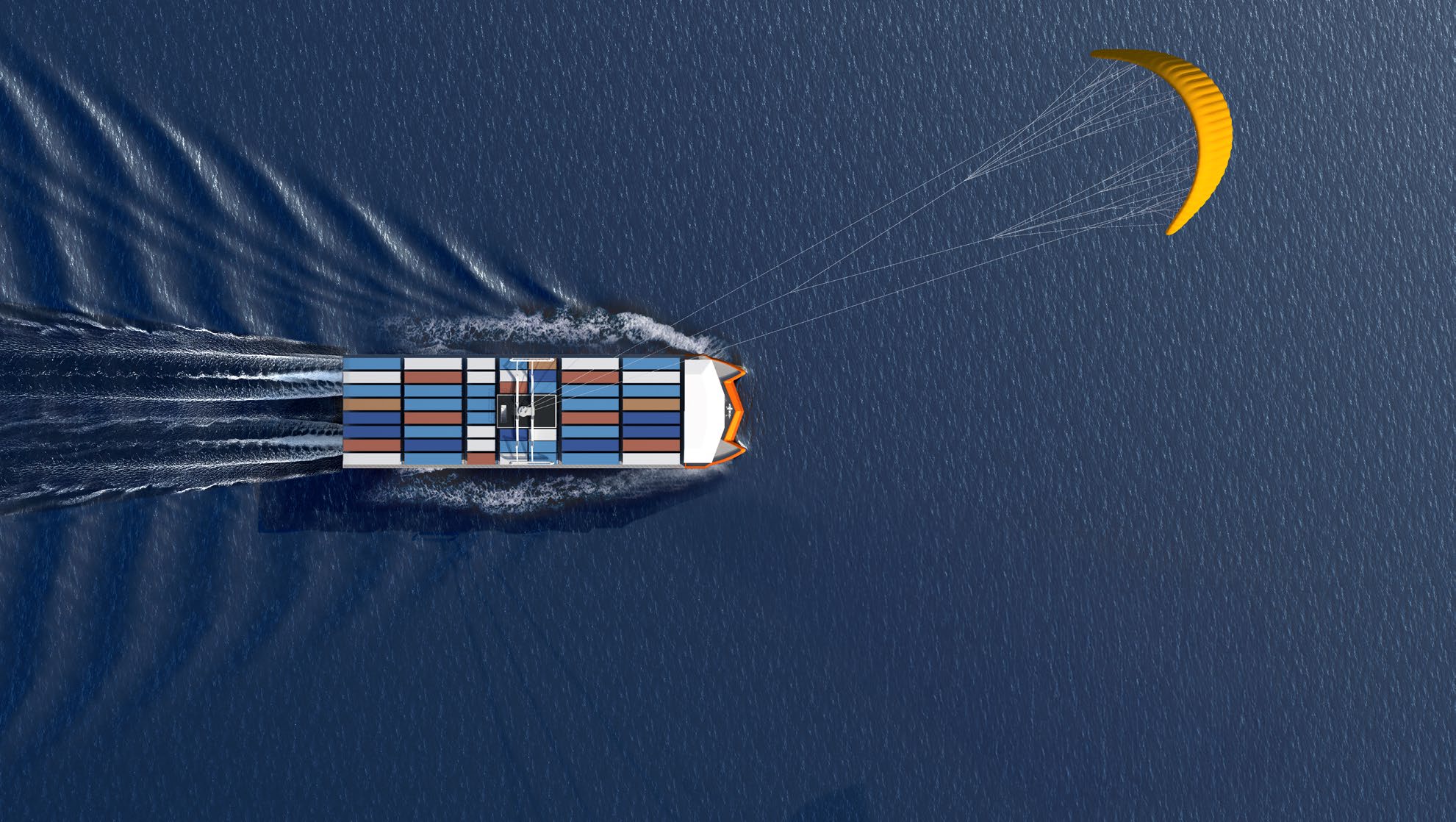
CargoKite is a Munich-based hard-tech startup with a pretty radical vision: that the cargo ship of the 21st century should be small, autonomous, and powered entirely by wind. Cargo shipping is a huge contirbuter to fossil fuel emissions, and although has operated for decades on the notion that bigger is better. Working within this $400 billion industry which runs on the dirtiest fuel on the planet, the company's goal is to build a new class in shipping that uses high-altitude kite propulsion to cut carbon emissions by up to 100% without asking shipping companies to take a financial hit to do it. The result is a totally new vision for a cargo vessel from the keelline up, using an unorthodox catamaran hull form (which allows for better performance and stability) and targeting the feeder-ship market.
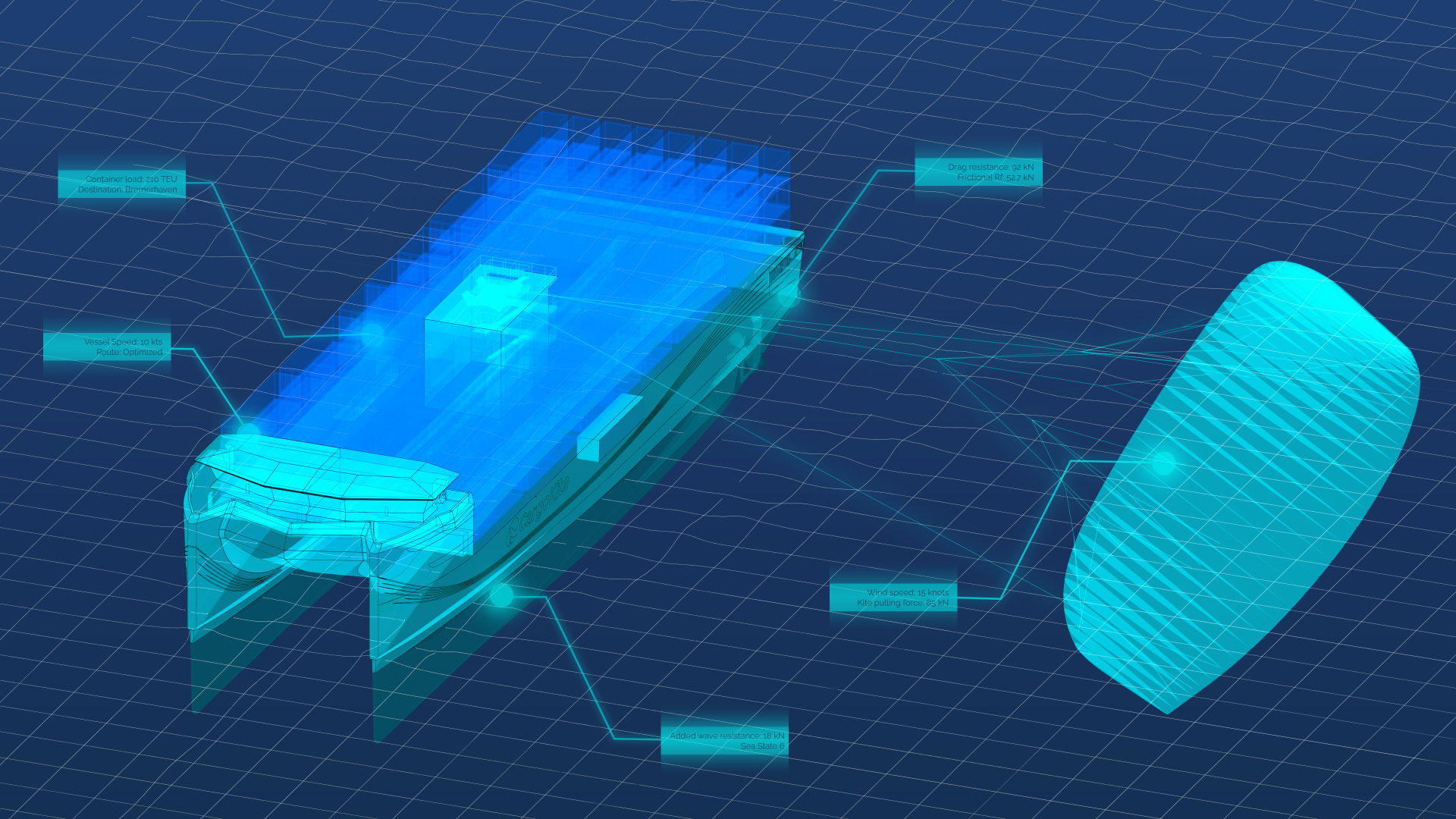
I joined as Naval Designer and Marketing Lead at a moment when the company already had a strong engineering foundation but no coherent visual identity to match. Over the following year, I worked directly alongside the CEO, head of naval architecture, and head of business development to define and build that identity from the ground up; three people with sharp technical opinions, commercial pressures, and not always overlapping ideas about where things should go. Navigating that, while simultaneously advancing the general arrangement of the CK-4 vessel and its full 3D model, meant the design work was never happening in a vacuum. Every visual decision had to hold up in a room with engineers, investors, and sketpic industry partners at the same time. What follows documents how that process unfolded: starting with the question of what this ship should look like and why, moving through the iterative hull styling work that became the foundation for the wider rebrand, and ending with the full brand system built to carry the company forward.
What should the cargo ship of the 21st century look like? How can the key technologies of wind power, remote operation, and rapid route optimisation be made visual in the design of a vessel? Beginning the design process to develop a clear and compelling graphic identity for the CK-4 vessel began with an exploration of parametric linework systems in Rhino x Grasshopper. The key design intent here was to portray a progressive, forward motion in an understated graphic sense, respectful of the natural forms of wind and waves. The environmental context of shipping (choppy ocean swell, howling winds) was a driving force behind the visual design process. Through a long series of iterations, an identity began to take form, reflected not just in the superficial hull design, but also extending to the geometric forms of the bridge deck.
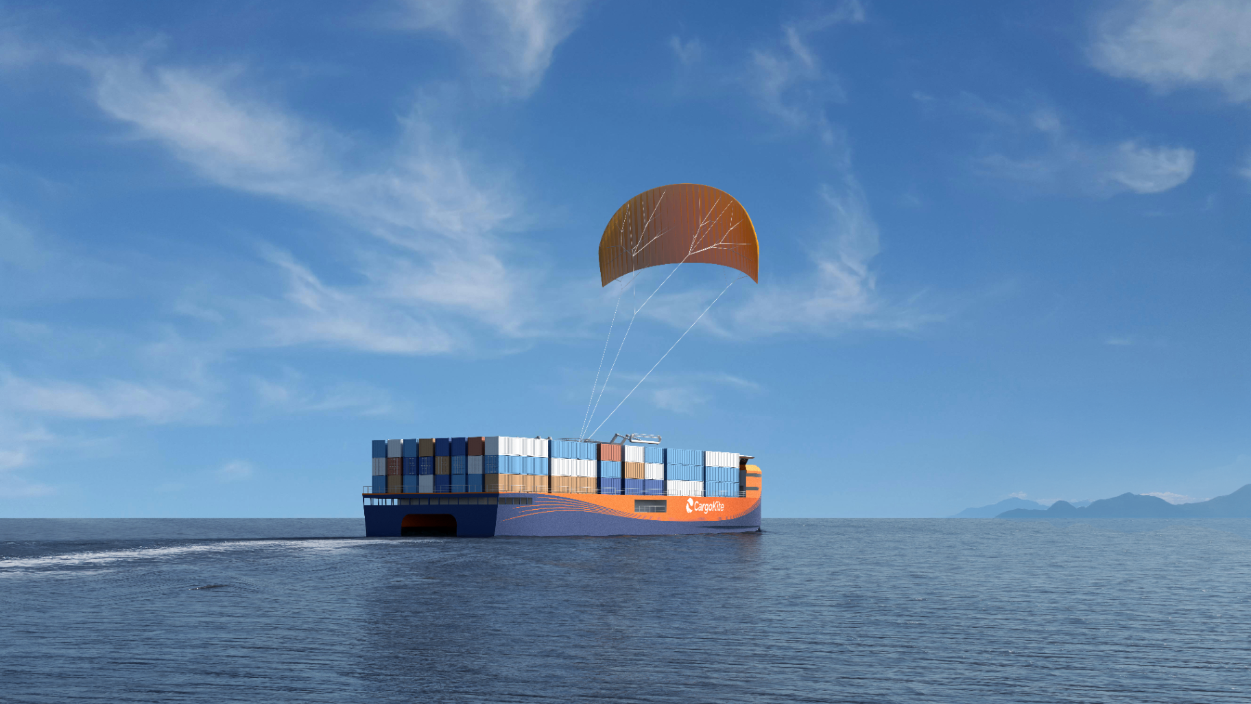
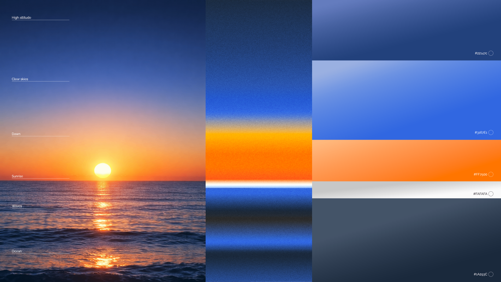
We weren't designing pretty paint lines for fun; as part of the start-up's first ever branding refresh, the design process, which began with the aesthetic makeover of the flagship CK-4 vessel, was the first step in redefining and clarifying the brand personality, making our values salient in a visual sense and conveying the radical nature of our goal with one glance. The process for finding the correct hull styling was defined by compromises, conflicting partys' interests, and strongly clashing opinions. Although this meant occassional discomfort, it resulted in a proposal that was technically sound, financially tolerable, and appealing to the key players. Most importantly, however, it indicated a compelling path forward for the brand redesign and conveyed a meaningful story which formed a strong basis for the brand's new graphic imagery. Based on the imagery of a sunrise, the revamped CargoKite brand identity pulled on the visual imagery of dawn: bright oranges set against a grounding navy blue used colour theory to make a boat that stood out against the water. The linework suggests fluidity and movement, being inspired directly from the streamlines our engineers used so frequently to visualise their aero- and hydro-dynamic caluclations and simulations. The result is a vessel which visually reflects its purpose, the brand's identity, and the mission we are striving to achieve.
With the visual language established, the work of fleshing out a full brand refresh began. This included every asset, like the colour palette, typography system, and brand guidelines, through to the full range of produced output: vessel renders and animations, explainer videos, technical diagrams and infographics, pitch decks, investor brochures and one-pagers, social media templates and campaign content, newsletter layouts, exhibition graphics, and PowerPoint presentation templates. There was no external agency or additional designer, just many pressing deadlines in quick succession. The full system was codified into a comprehensive 48-page brand guidelines document, distributed for both internal and external reference. It covered everything from logo usage rules and colour application to typographic hierarchy, image tone, and layout principles; giving anyone working with the brand the tools to apply it consistently, without having to come back to me for every decision. The rebrand required constant negotiation between stakeholders with different priorities: the CEO pushed for a bold narrative to excite investors, the head of naval architecture prioritised technical accuracy, and the head of business development focused on how the brand would land with sketpic shipping industry partners. Holding those tensions together, without losing the coherence or ambition of the work, meant being really strategic with my choices. The goal throughout was to close the gap between what CargoKite actually is, a technically serious, investor-backed deep-tech company with patented technology and a real path to market, and how it needed to be perceived: urgent, credible, and worth paying attention to.
CargoKite is a Munich-based hard-tech startup with a pretty radical vision: that the cargo ship of the 21st century should be small, autonomous, and powered entirely by wind. Cargo shipping is a huge contirbuter to fossil fuel emissions, and although has operated for decades on the notion that bigger is better. Working within this $400 billion industry which runs on the dirtiest fuel on the planet, the company's goal is to build a new class in shipping that uses high-altitude kite propulsion to cut carbon emissions by up to 100% without asking shipping companies to take a financial hit to do it. The result is a totally new vision for a cargo vessel from the keelline up, using an unorthodox catamaran hull form (which allows for better performance and stability) and targeting the feeder-ship market.